Continuing my work in the Paso Robles wine scene, Peachy Canyon reached out to me to create their marketing materials and printed inserts to go out with their quarterly wine club shipments.
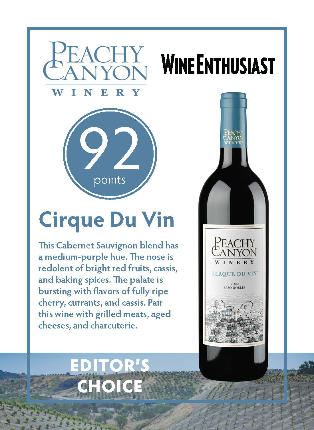
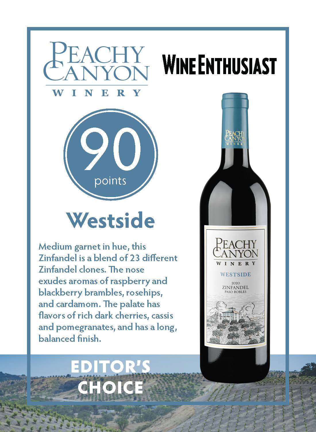
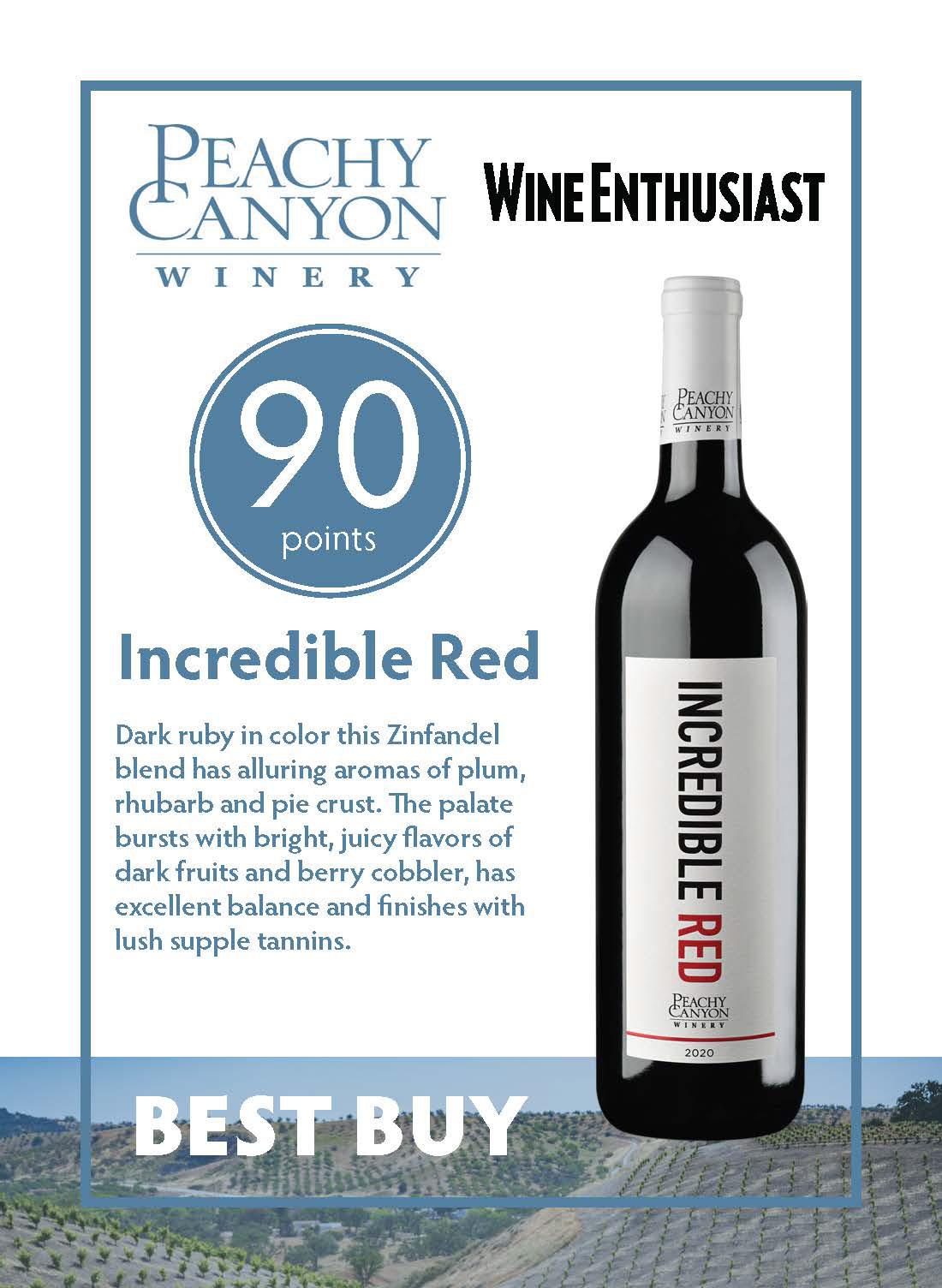
Above are shelf talkers that were put out in retail stores alongside their respective wines. The emphasis was to prioritize the wine's score and title to draw the viewer in, then follow up with the tasting notes to sell the wine to intrigued shoppers.
I was also tasked with making the quarterly wine club insert. The process began in the sketching phase:
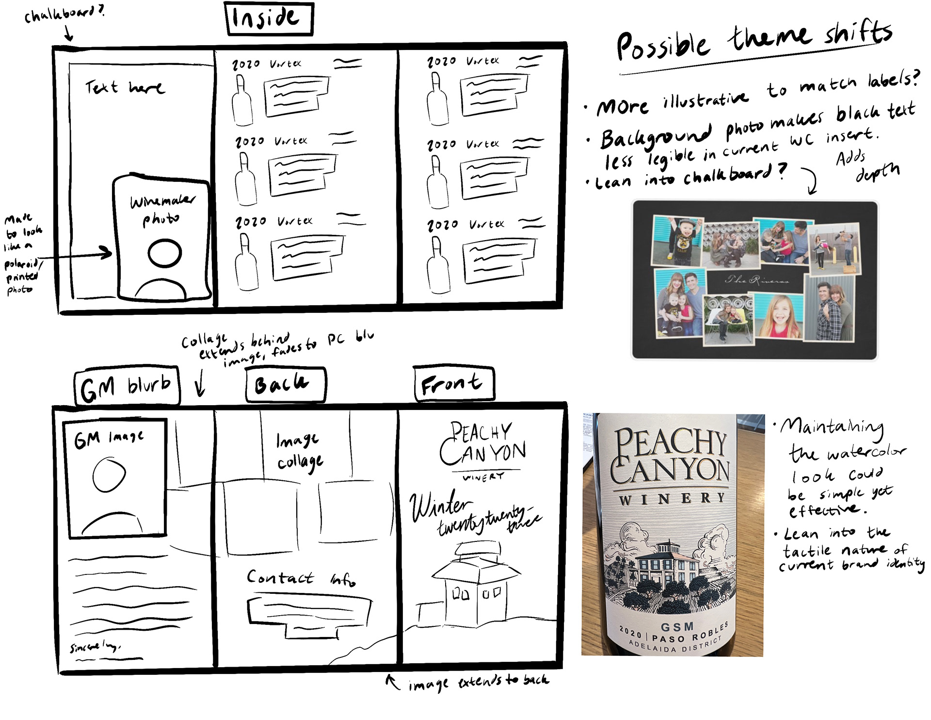
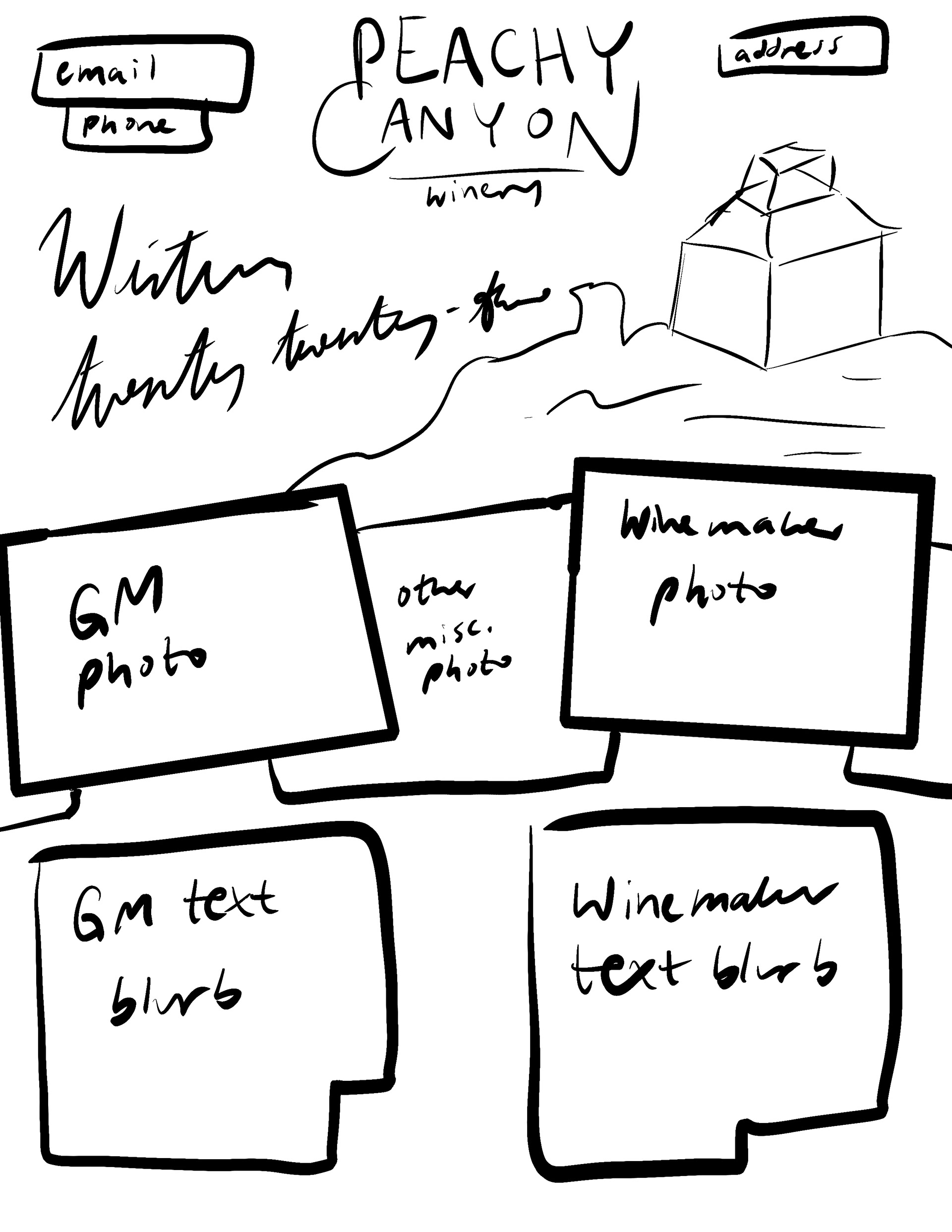
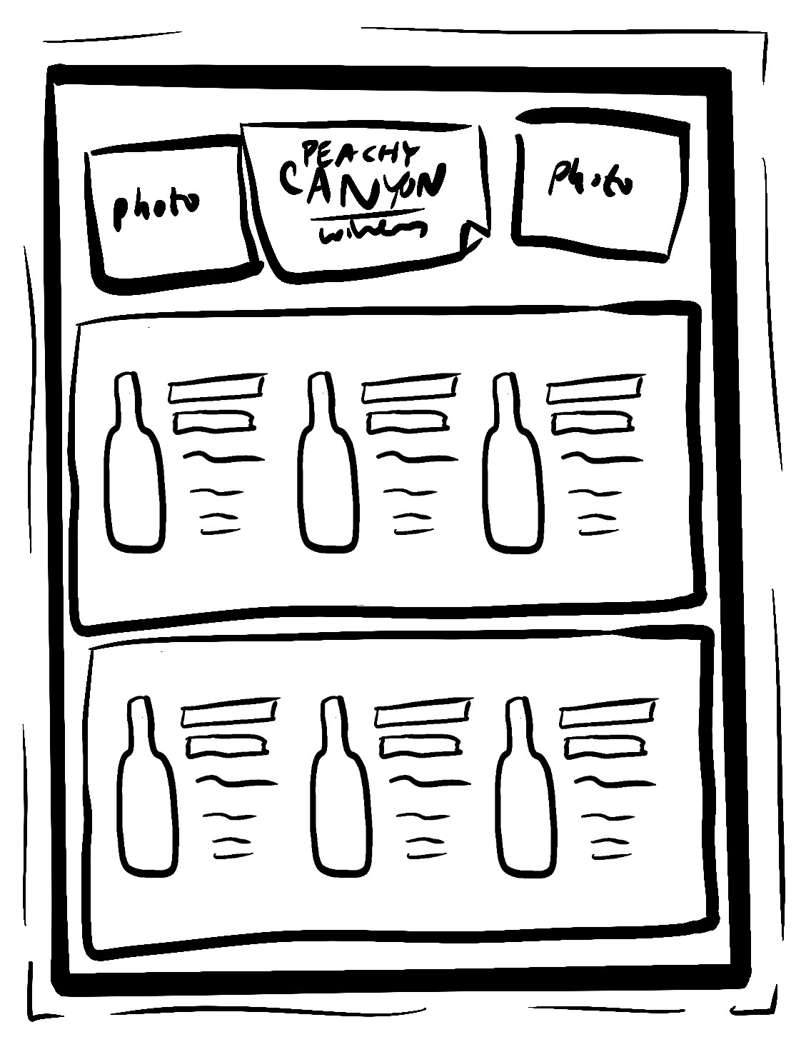
The insert began as a tri-fold brochure in concept but transitioned to a letter-sized document after some workshopping and logistics from the winery printing team. I work through designing by questioning myself and assessing the purpose of all elements in the design.
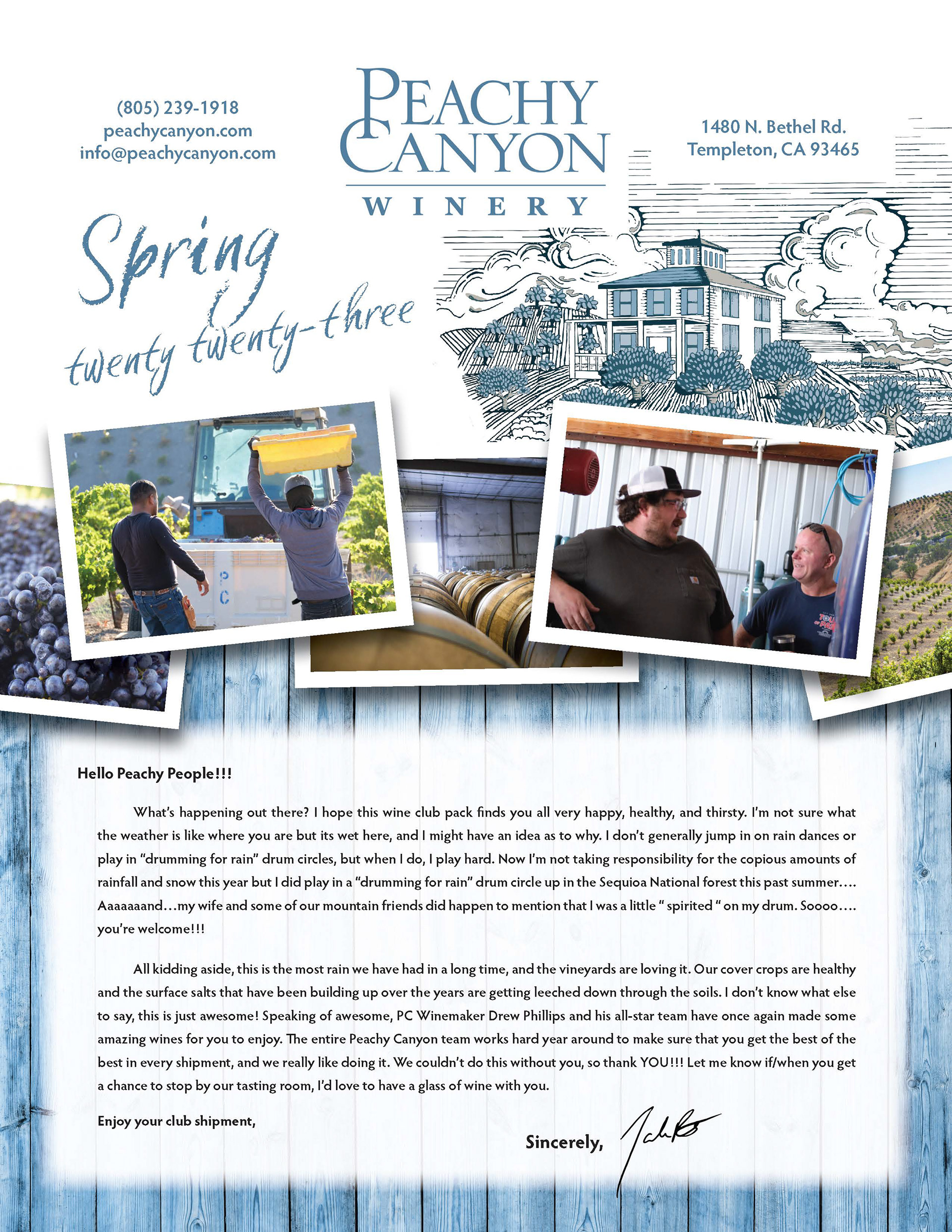
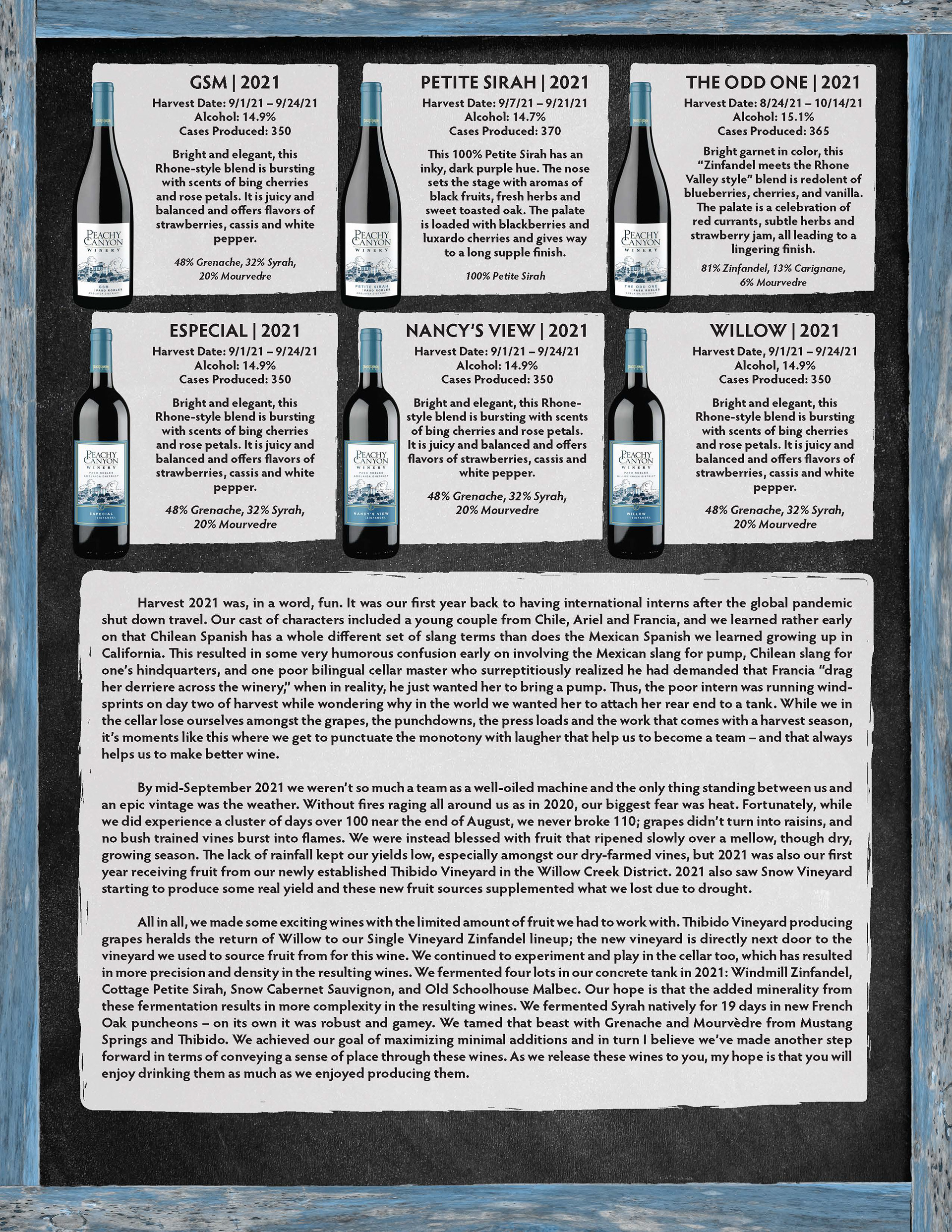
After some time in InDesign, this was the first digital draft that was faithful to my original sketches. It had a rugged yet playful tone that stayed true to the winery's branding and physical farmhouse location.
The Peachy Canyon Winery Tasting Room
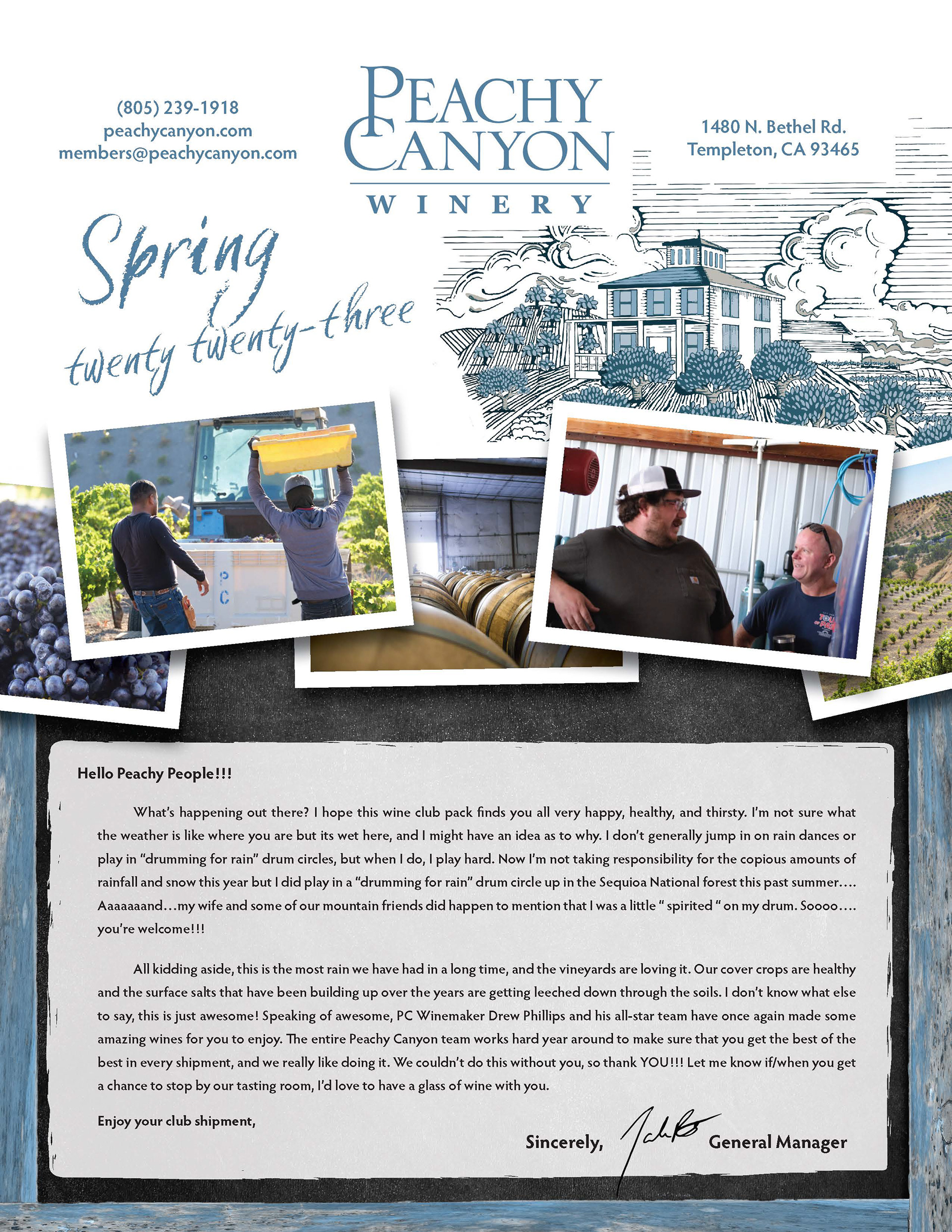
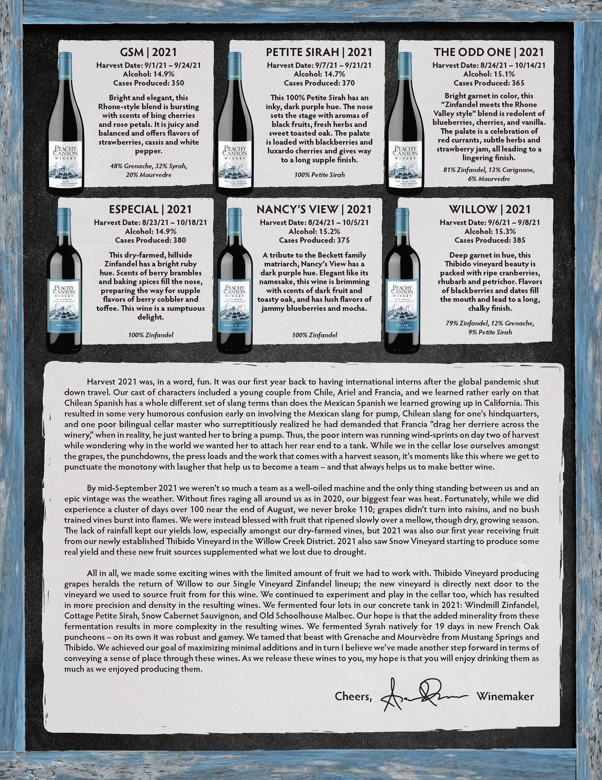
After some revision, this was the final print that went out. It leaned into the chalkboard aesthetic on the front to be more cohesive with the backside. This pulled the whole design together and was the last step necessary to make the design really pop.
In the fall, they wanted me to revise the design and information for their Quarter 3 shipment. Below is that exploration and the final design.
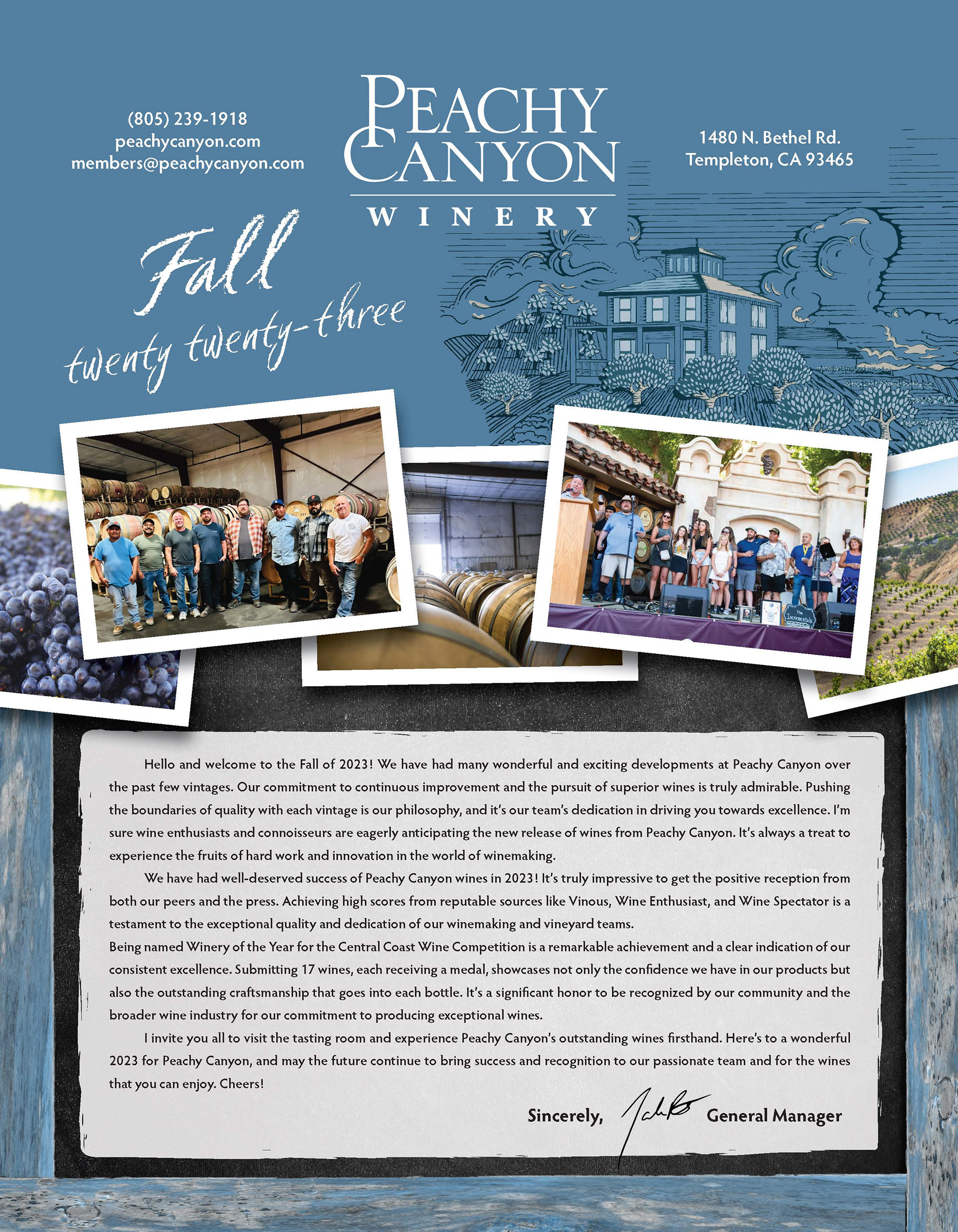

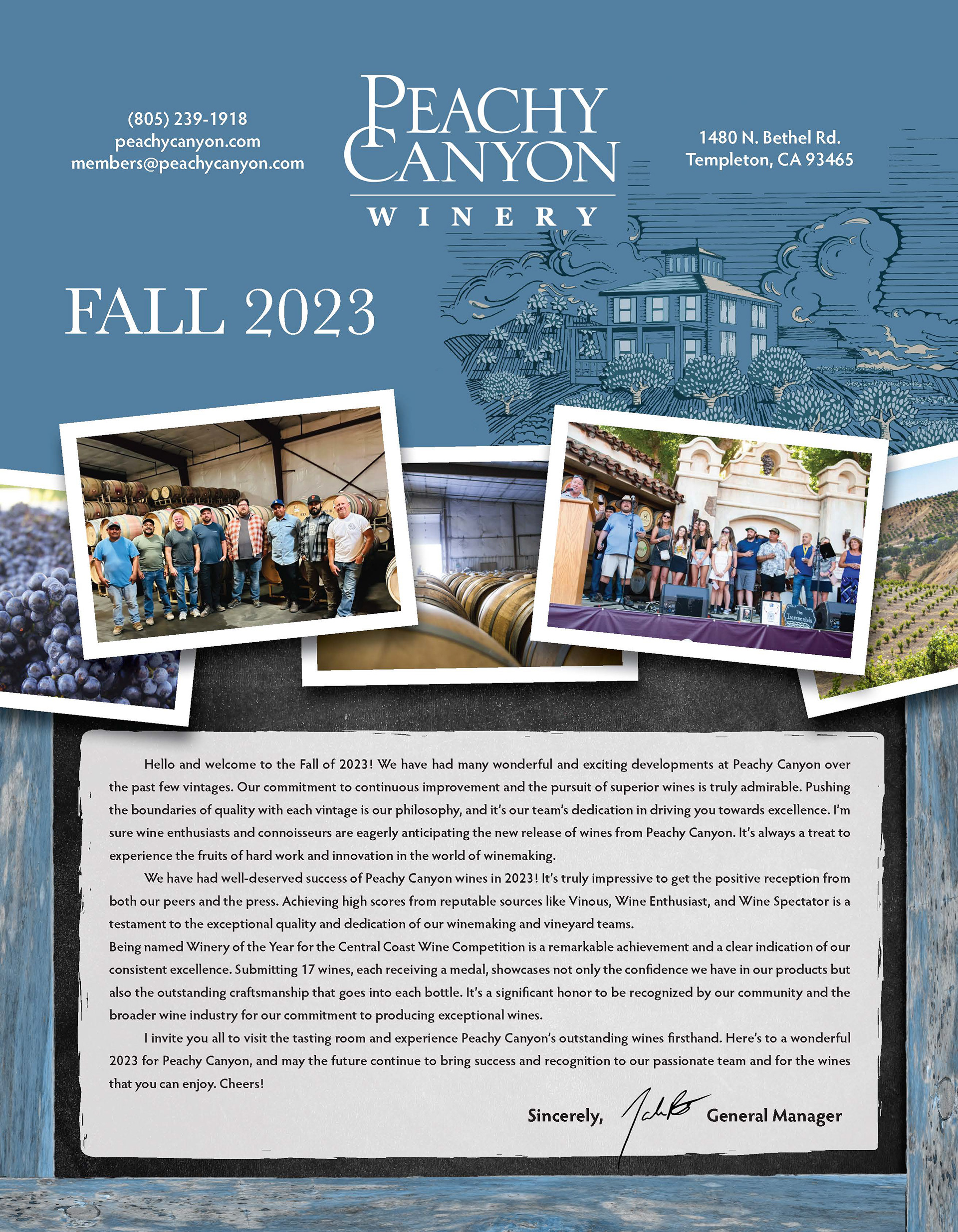
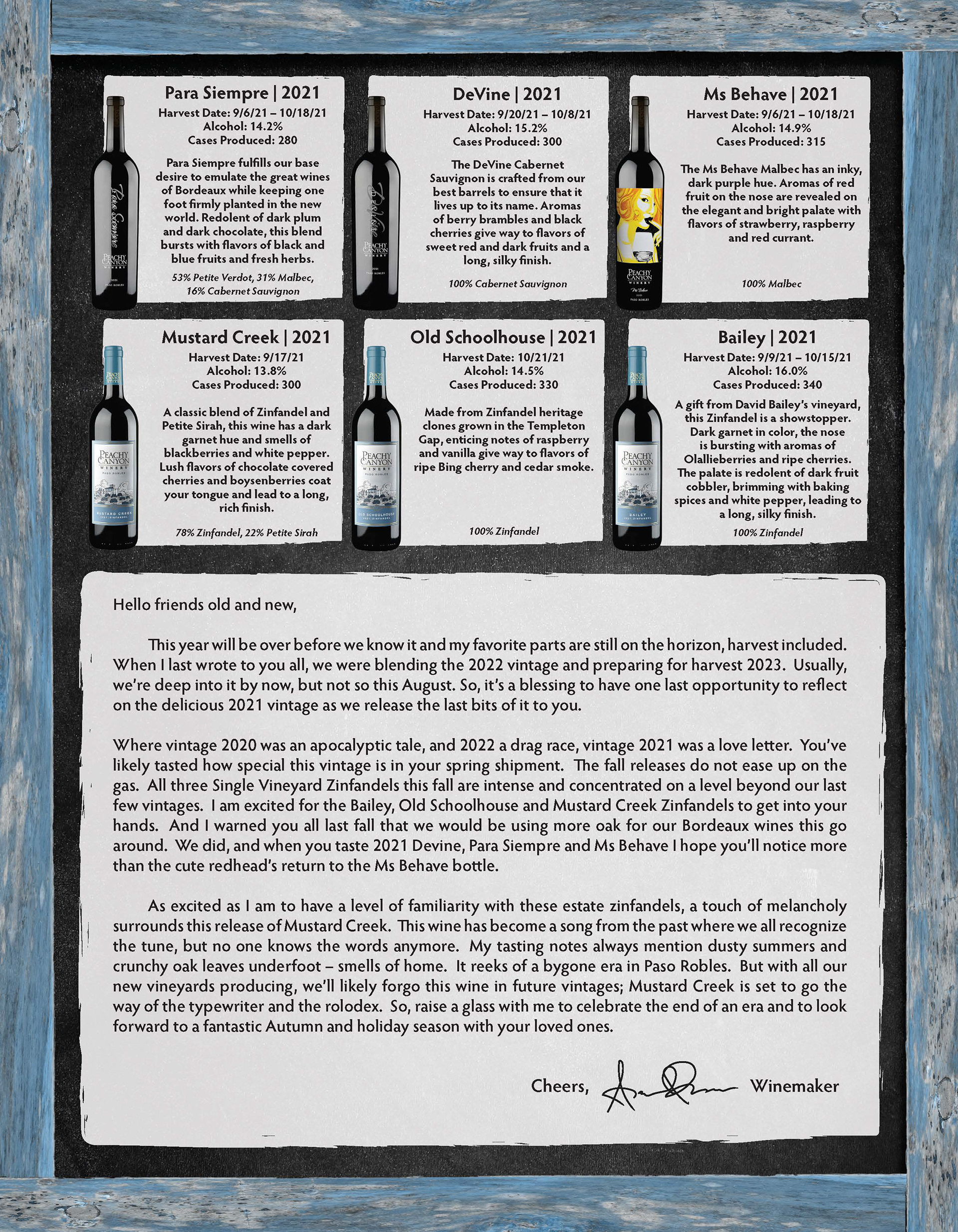
To the left is a design that kept the cursive style in the title, as well as an updated blue background to make this shipment more distinct. To the right is the final version that went to print, with a title that was a bit more legible. The photos, messaging, and wine information still flowed well despite having completely different body text and images.
